Why you must be following social media brand guidelines
Social media icons are now common place for providing quick links to your company accounts. However, there are things to consider before using them!
Some of the most recognisable icons in the world now belong to social media companies. You don’t need to see the name to recognise the famous blue of Facebook or the bird that has become so synonymous with Twitter.
Social media icons are now common place, and are almost ‘must haves’, on websites, emails and marketing material to provide quick links to your company accounts.
However, there are things to consider before using all of these icons. It’s very important to remember that these icons/logos are also the respective company’s registered trademarks. Therefore they will all have copyright protection, so you can’t just use them willy-nilly.
Think about it, if a design agency was to alter your logo in any way, say change the colour, no doubt you would be furious and demand it to be changed, and it might be your company has a huge coffee table sized brand guideline book that all internal and external parties must adhere to.
So, why would it be OK to put the Facebook logo in, say, red? Or place it within a hexagon shape just because it matches your brand?
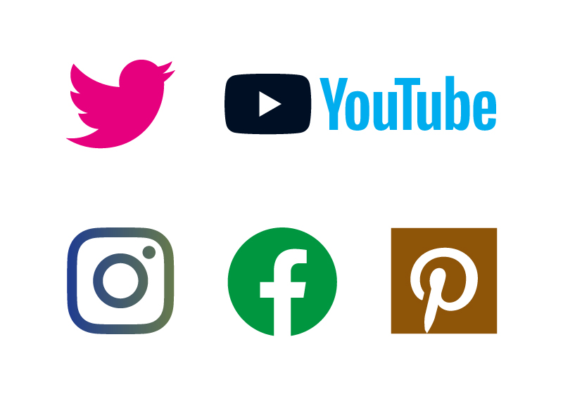
The rules for each icon vary, Twitter for example allow you to use the bird in only white or blue, however it can be placed with a shape and colour of your choosing. Facebook, however, must only be in their set colours of blue, white or black.
Having the social icons in their correct colour may not fit stylistically with your look and feel but at the end of the day you can’t make changes to these logos because they are registered trademarks. One must consider that breaking these guidelines may incur the wrath of one of these companies and I suspect their legal team is something most people would not like the headache of dealing with.
Each of these companies provide their brand guidelines online and have contact details if there are any questions about how to use their brand. Below we have listed minimal guidelines for each of the main social media companies as well as links to their respective brand guidelines. Please view the guidelines to see the full list of requirements.
Social media icon brand guidelines
Assets:
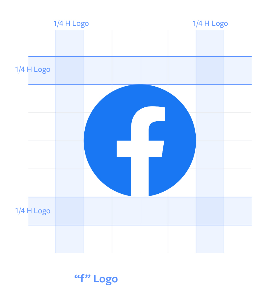
- Only use the F logo in the correct colour and shape
- It should be the same size as any other icons used
- Do not modify or deconstruct the logo in any way

Assets:
- Only use the icons from the assets provided
- You can replace the colour with any solid colour
- All other aspects of the design should remain unchanged

Assets: https://about.twitter.com/en/who-we-are/brand-toolkit
- It is preferable to use the icon without a container but you do have the option to use it in a circle, square or a square with round corners.
- Only use the Twitter blue or white, you can display it in black but you must get permission from Twitter and only if there are technical reasons to do so.
- If the logo is to be placed onto an image it must be in white.
- Do not surround it with other birds or animals
https://about.twitter.com/en/who-we-are/brand-toolkit
Assets: https://brand.linkedin.com/downloads
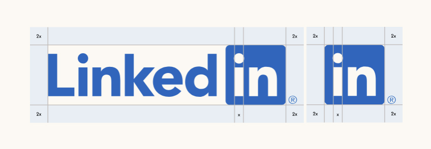
- LinkedIn prefer that you use a solid white background to display its logo, if that’s not possible then you may use a solid light colour
- The icon should always be in a rounded square container
- Do not modify or alter any elements including the colour
https://brand.linkedin.com/policies
YouTube
Assets: https://www.youtube.com/about/brandresources/#logos-icons-colors
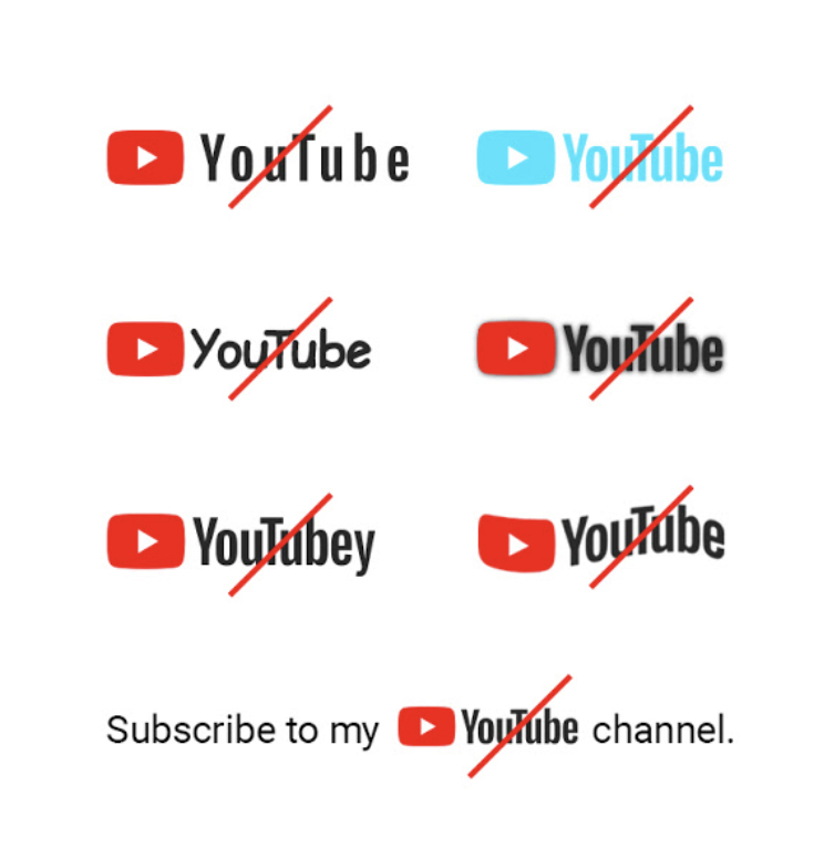
- There must be a clear space around the icon (at least half the width of the chosen YouTube logo)
- Never alter the shape or form of the logo – this includes replacing the typeface
- Do not use any other colours apart from the YouTube red, white or (almost) black.
Assets: https://business.pinterest.com/en/brand-guidelines/
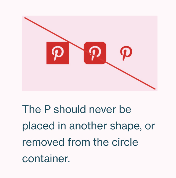
- You must always use the Pinterest logo in Pinterest red with no alterations, both online and in print
- Do not use the wordmark in place of the logo
One thing to note is that these companies frequently tweak or change their guidelines, so it’s worth staying up-to-date with them and checking each time before you use their icons/logos.
So the next time you come to use social media icons for your company it’s worth checking through these guidelines and making sure that you adhere to them.
The easiest way is to be as precious about them as you would be your own identity, if it means everything to you and your company then the same applies to the social media companies.