Be Prepared; Google is Refreshing its Mobile Algorithm in May
Last year, on 21st April, Google released a Mobile Algorithm update called Mobilegeddon. This update was designed to boost mobile-friendly pages in Google’s mobile search result pages.

Google recently announced that they will be refreshing this mobile algorithm update at the beginning of May 2016. However, Google being Google, they have not confirmed the exact date yet! They also highlighted that the refresh will roll out gradually, therefore, you won’t see a major drop-off on non-mobile-friendly websites when the algorithm is pushed out.
If your website is mobile friendly, you have nothing to worry about! However, if your website still needs this transformation, you will need to act quickly. This algorithm update could potentially affect your site’s SEO visibility on mobile devices.
Why is mobile website important for your business?
Mobile websites open a large spectrum of opportunities for your business. By understanding what devices and operating systems your audience are using, you will be able to understand the importance of mobile traffic to your business, and therefore, the importance of having a website which is easily accessible from a mobile phone.
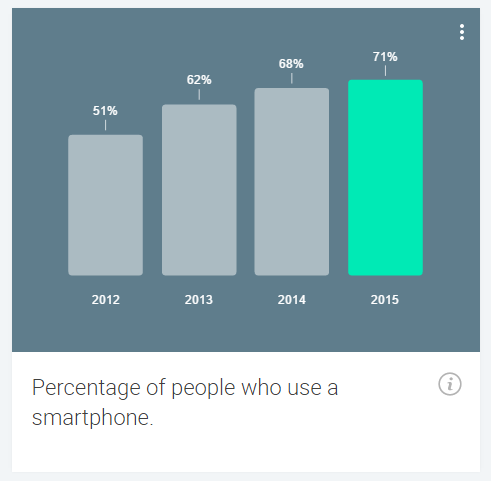
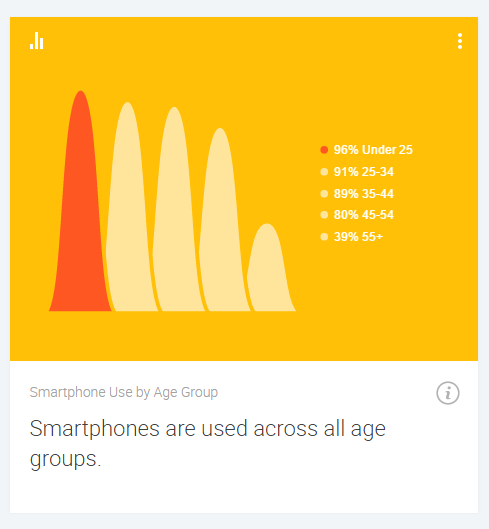
As you can see below, in 2015, over 70% of people used their smartphones to access online data. Smartphone devices are used by people across different age groups, therefore, it is vital that you accommodate to those who are browsing your website via mobile devices.
One question to ask yourself…is your website mobile friendly? If you are unsure, you can run a mobile test to find out!


(Source: Consumer Barometer)
What is a responsive design?
When developing a website, it is important to consider a ‘Responsive Design’. A Responsive Web Design (RWD) is one which is able to re-size according to different screen sizes and orientations.
If you would like to find out whether your current website is responsive, a simple test is to open your website up on your mobile or tablet devices to see whether it fits the screen and the text is clear to read.

(Source: Generate UK Responsive Design Example (Orange & Black))
If your website doesn’t have a Responsive Web Design, don’t panic! At Generate UK, our team of digital experts are more than happy to provide information and guidance on how to go about changing your website to meet Google’s ever-growing requirements.