How to choose the right font pairings for your website
Read on to find out how choosing the right font pairings for your website can help develop your brand identity.
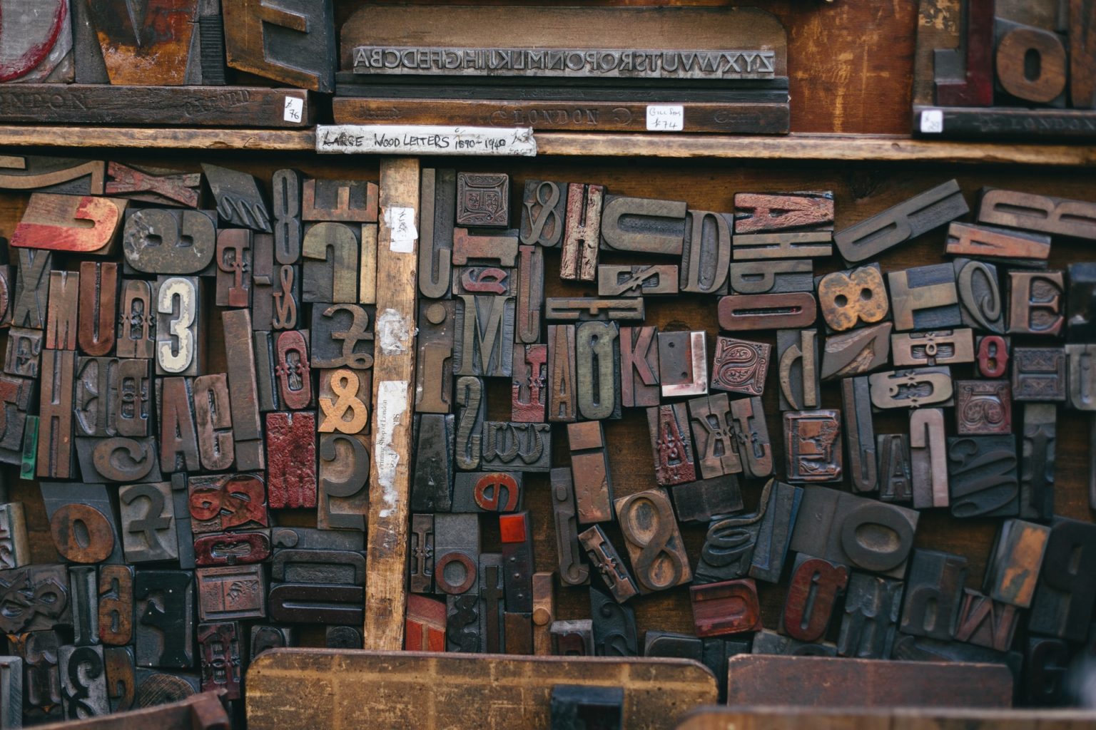
When it comes to choosing a font, for your website you may not consider it a vital step, but it is more important than you think. A font style can set up the whole theme of a page. It can show a consumer whether you are a professional, serious business or whether you are more laid back and fun.
A font can tell your consumer a lot about what type of business you are, so you need to make sure you get it right. In this post we will be discussing how to choose the right font pairings for your website.
What do we mean by font pairings?
Font pairings simply means matching the different font styles together to create a bold, attention grabbing design.
There are two general categories of font types: serif and sans serif.
Sans serif fonts are made up of simple lines, whereas serif typefaces use small decorative lines to embellish characters and make them easier to read. These are typically the fonts you would find for headings in newspapers – but add a luxury touch to a website looking to sell a high-end product.
A well thought out font pairing can make a good design, great. However, there are several factors we need to consider. This will ensure that it not only looks good but is also practical. Make sure you consider whether your font pairings meet these requirements:
Legibility
You can use the beautiful scroll font which looks great, but can you clearly make out the text? If in doubt, check the font on all devices, especially mobiles.
You have probably noticed how newspapers often favour the serif fonts as they are clear and bold. These fonts also have the bonus of readers being able to distinguish between similar looking letters, which makes comprehension easier and a smoother reading experience.
The selected fonts also need to be readable. Make sure the spacing, and sizing of your font is also correct and suitable for your target market.
Brand style/identity
Once you have created a brand identity, make sure you refer to this when you are deciding on font pairings. The primary font you select for your brand will be one of the key assets in deciding the tone, perceived feelings and message of your brand.
If you read something which was written in a childish font you would think of something fun and engaging meant for children, rather than adults.
If you read a heading with a grungy, strong, impactful font then you would think of something adventurous like a gym or theme park.
Sample the font by placing it next to some of your brand elements to get a true feel of how it will look with it.
How to find fonts
Rather than buying a font before you get a chance to sample it, you can go to Google’s font studio and try out a large variety of styles both serif and sans serif.
Once you have made sure the fonts you like meet all these and you are happy with the typography you are ready to go!
But if you are still stuck for font pairing ideas, we have created some matches for you below:
Modern
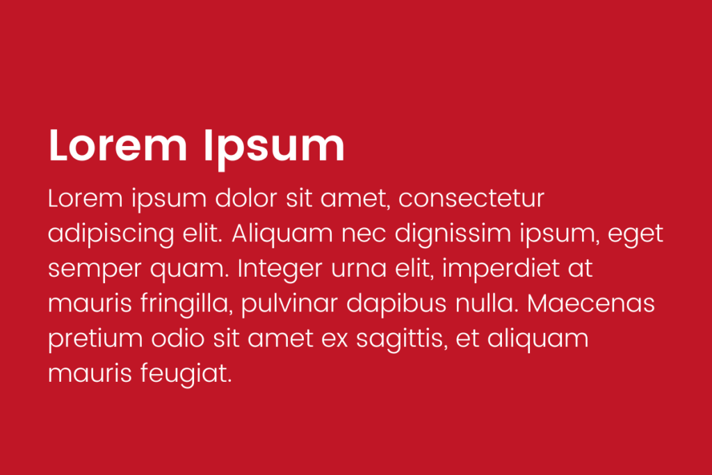
Heading font: Poppins
Body font: Poppins Light
This font pairing is simple, clear, readable, and modern looking, perfect for a start-up or technology company aiming for a younger audience. You could even step it up a notch and use these two in contrasting colours to make the headline truly stand out.
Fun
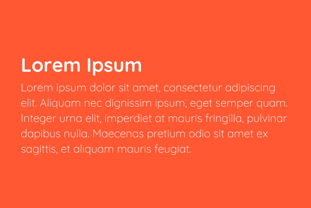
Heading font: Quicksand
Body font: Quicksand Light
This is a great example of how you don’t have to use completely different typography to create the perfect font pairing. In fact, you can just use two fonts from the same super family like in this example.
If you are looking for a font pairing that is modern but a bit more fun, then this could be the perfect one for you.
By using Quicksand in two different weights it creates a fun, light, modern look whilst still looking professional. The sans serif style with the rounded terminals gives it that friendly, approachable vibe.
Technology
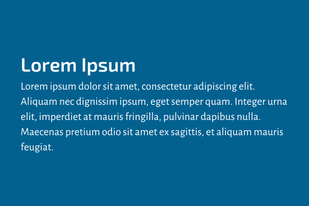
Heading font: Exo 2
Body font: Alegreya Sans
The Exo 2 exudes a nice futuristic vibe whilst the Alegreya Sans brings you back down to earth.
This pairing is attention grabbing and would look great on a technology website due to its unique mixture of futuristic and relaxed qualities.
Fashion and Retail
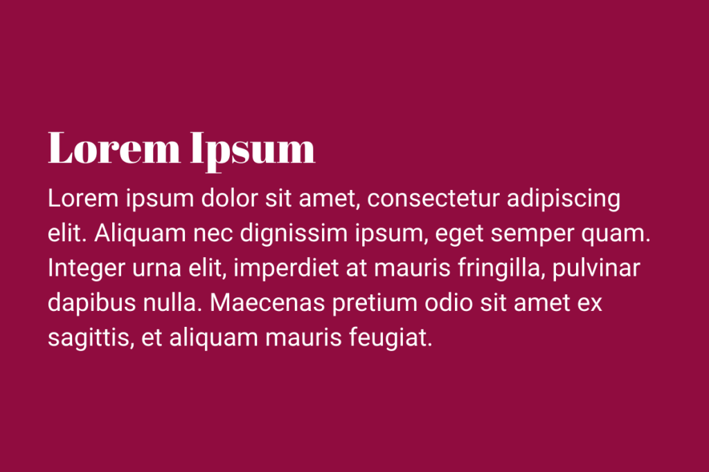
Heading font: Abril Fatface
Body font: Roboto
When it comes to fashion and retail you want your headings to wow, and you want your brand to have a strong personality so that it stands out amongst your competition. The mixture of the chic curls of Abril Fatface and the thin, sleek serifs of Roboto achieves a modern, fashionable, attention grabbing look. Perfect for fashion itself and many retail sites, especially those aimed at Millennials and Generation Z.
News
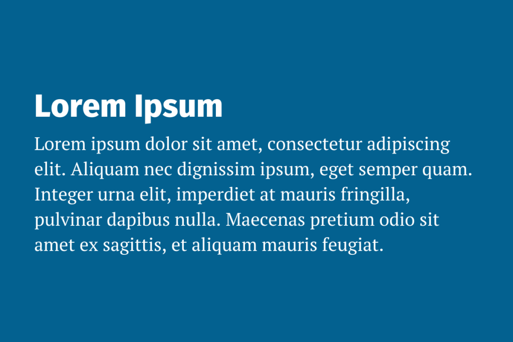
Heading font: Fira Sans
Body font: PT Serif
Due to the clear legibility and readability of this font pairing this would be great for text heavy sites such as news websites or a blog.
Minimalistic
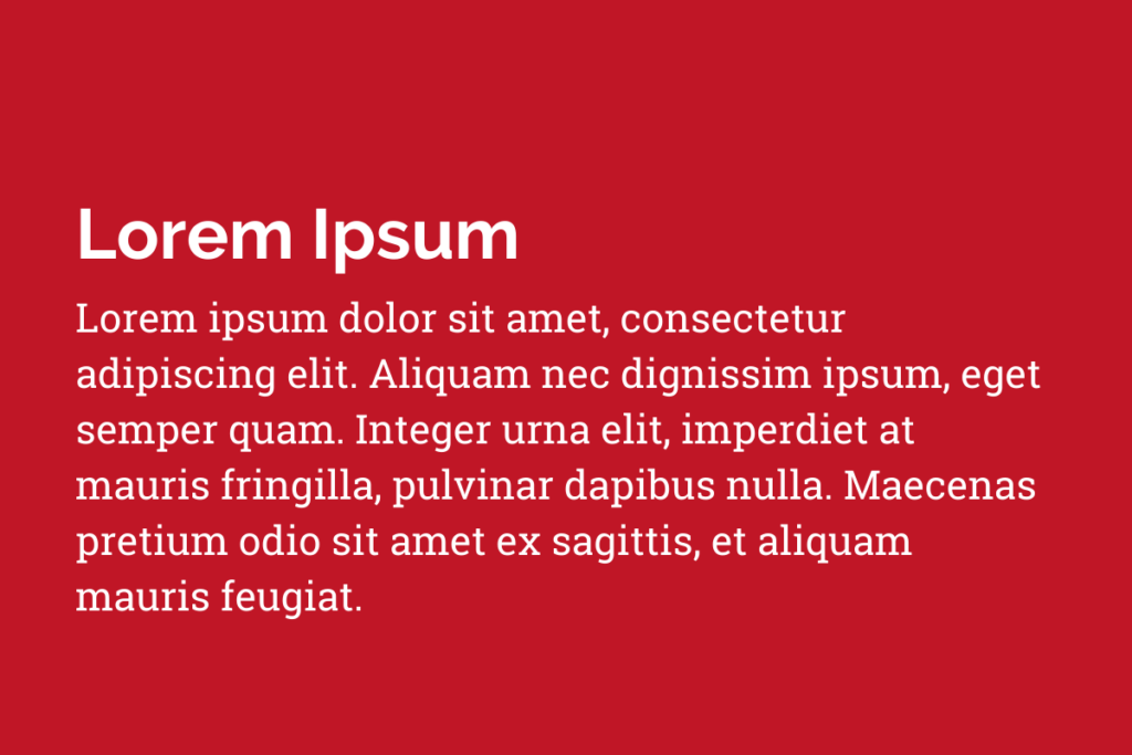
Heading font: Raleway
Body font: Roboto Slab
The Raleway font has a unique charm which almost feels like it is emitting waves of calm. Mixed with the spacing of the letters it also gives off a nice minimalistic vibe. Combine this with Roboto Slab which appears more natural through its round curves and you have a great pairing for a minimalistic, clean looking site.
Retro
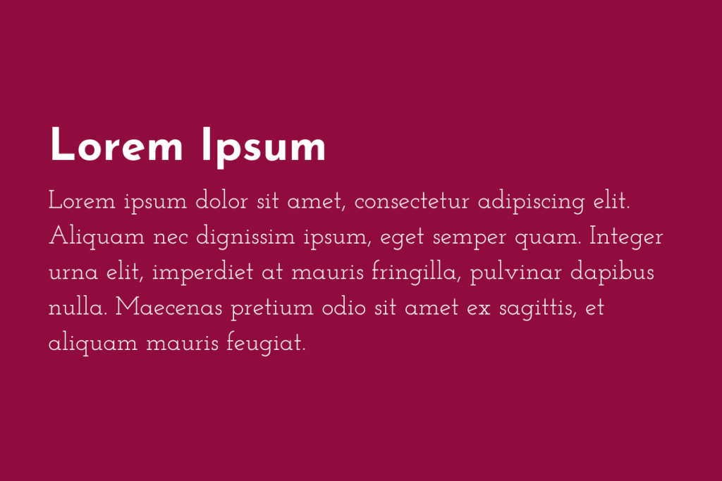
Heading font: Josefin Sans
Body font: Josefin Slab
These vintage style fonts look great together and they exude a strong 20/30s vibe. These would be great for either a retro styled site or even if you want to have a retro theme in your promotions.
Professional Services
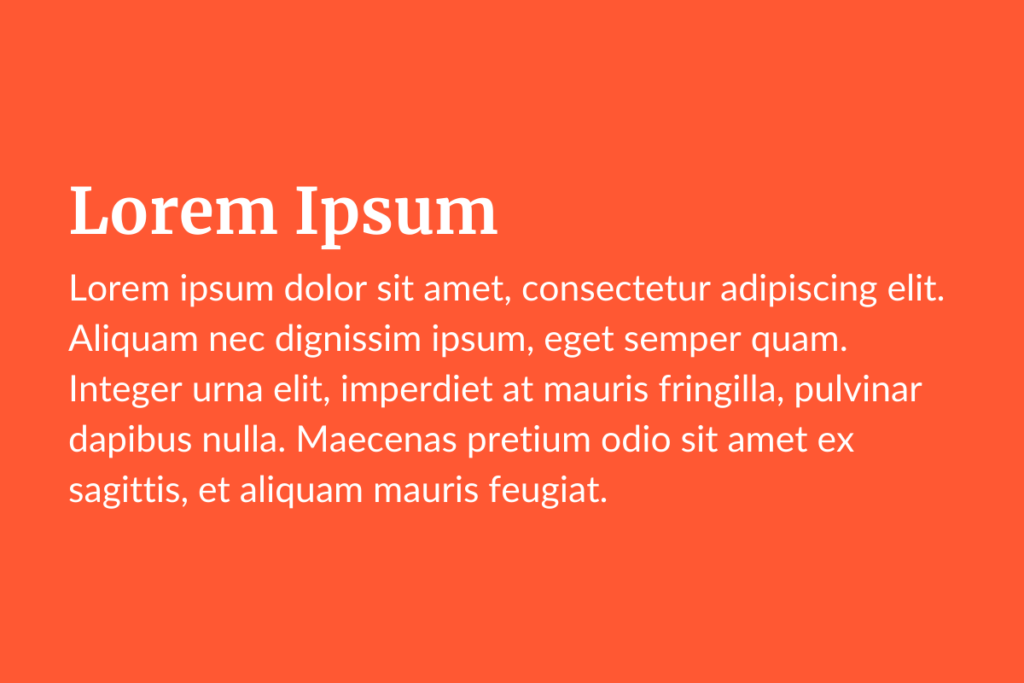
Heading font: Merriweather
Body font: Lato
These two fonts together look clean and professional. In addition, it is clear, bold and fully legible which altogether makes it ideal for professional services websites (i.e lawyers, accountants, telecoms etc)
For your inner child
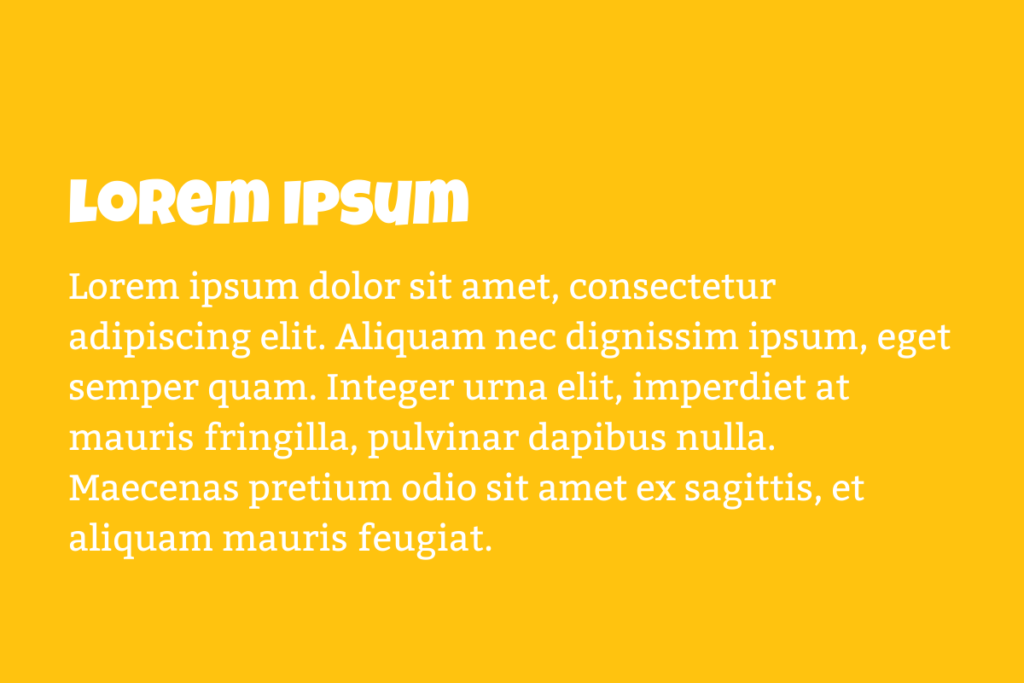
Heading font: Luckiest Guy
Body font: Bitter
If you are aiming for a child friendly or even simple a fun and playful site this is a great font pairing.
Luckiest Guy is a prominent font. By using capital letters and block writing comes across as a more playful typeface.
In contrast, the use of Bitter Regular is a simpler font, but combined it’s the perfect match for showing a brand’s youthful side and helping to release that inner child in your consumers.
Luxury
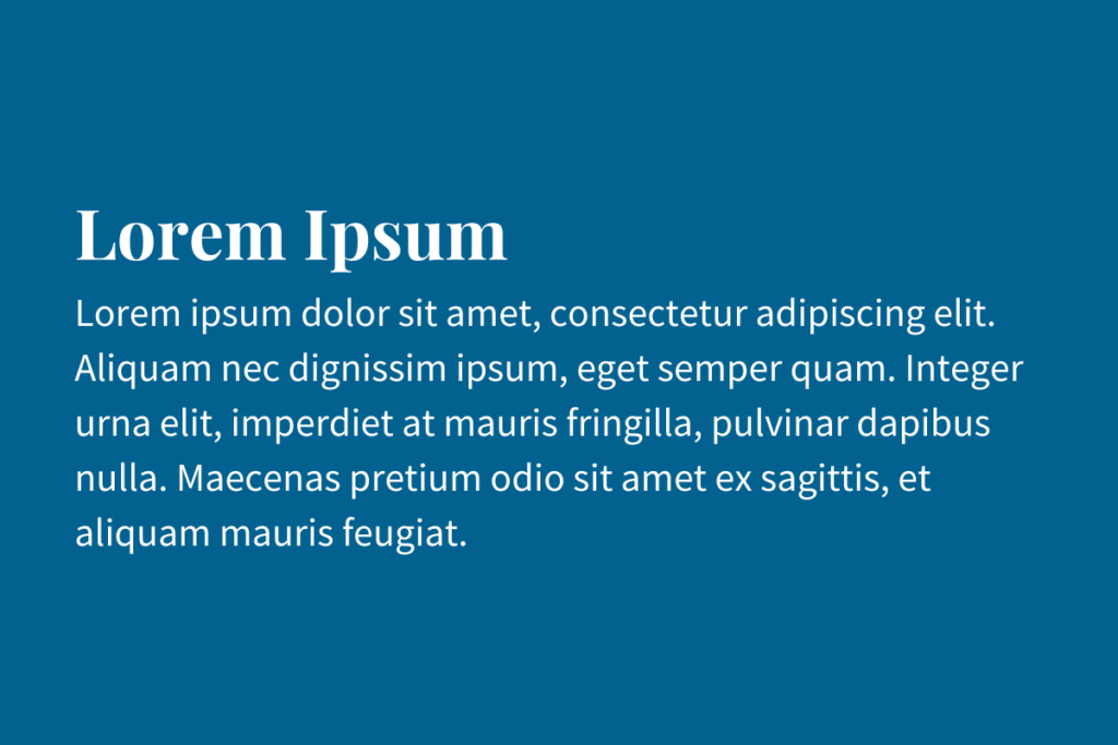
Heading font: Playfair Display
Body font: Source Sans Pro
This font pairing is perfect for those luxurious, rich brands. The typography oozes elegance and luxury. Playfair Display is especially effective when you want a larger font for headlines. The font was inspired by 18th century letterforms and it has that classical charm with a twist of modernity. It conjures up images of the elegant classic actresses such as Marilyn Monroe and Audrey Hepburn on an Italian beach or driving along the coast with the roof down. That perfect blend of elegance and luxury.
B2B Ecommerce
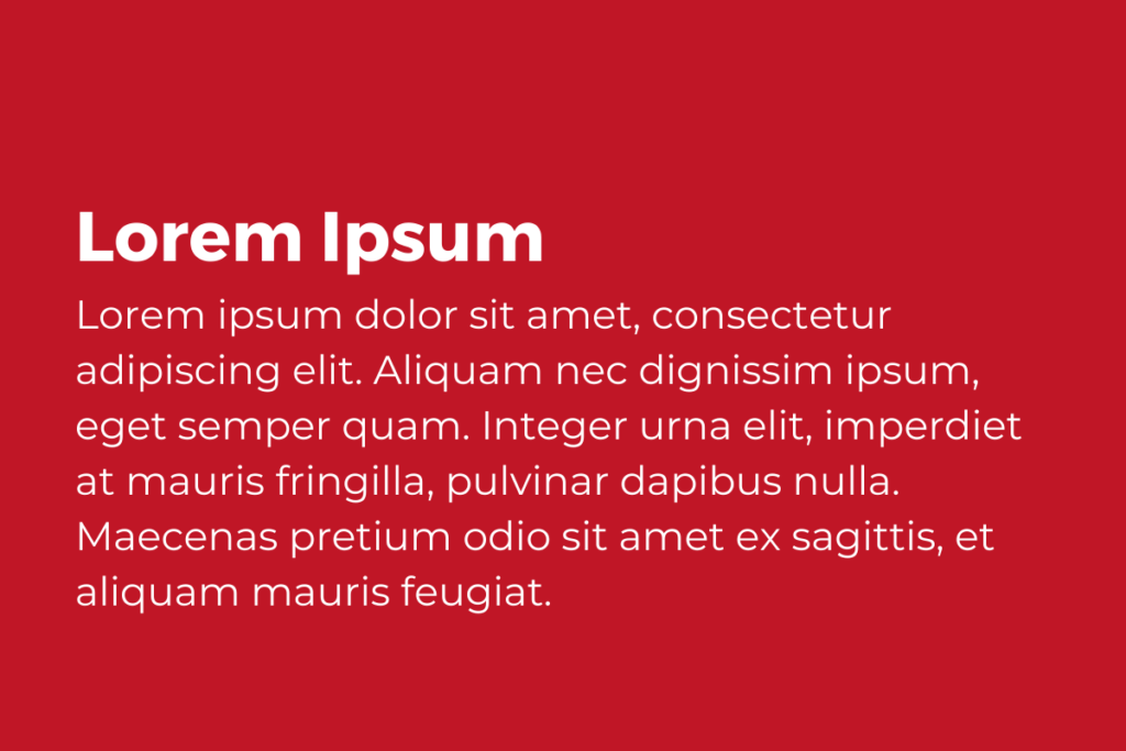
Heading font: Montserrat Bold
Body font: Montserrat Regular
For a B2B ecommerce store you want clear, bold, legible font pairings. But that doesn’t have to mean boring. The bold weighting of the heading font means it is much heavier than the body and stands out clearly. The mix of two Montserrat fonts provides a clean, professional, and serious font pairing for your site.
There are so many great font pairings out there, but these are just a few of our favourites. Why not go and experiment with the Google font studio and find yours?
However, if you are still looking for help to develop your brand identity or assets look no further. With over 12 years’ worth of experience, we are in the perfect position to help you not only choose your perfect font pairing but also build up your brand and increase your sales. Working with a leading B2B Marketing Company, based in Theale, Reading, Berkshire.
Contact us today to find out how we can help you build the best website to display your brand identity.