Generate UK Review: Morrisons Rebrand & What is a Rebrand?
Morrisons, based in Bradford, is the fourth largest supermarket chain in the UK. It operates in an industry which, as we all know, is struggling under the pressure of rising competition from the heavy discounters – Lidl and Aldi.
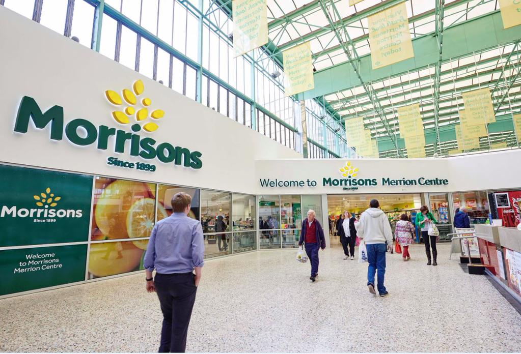
Morrisons have recently embarked on a brand review and rebrand. Unusually, this rebrand has been public knowledge for a while, with Intellectual Property patents for a new logo occurring several months before the logo was tested on a number of Yorkshire based stores. The testing included feedback from customers, a wise choice when you look into the negative customer reactions to many expensive and failed re-brands eg Pepsi, Tropicana and Gap (we will cover these in more detail later on). The new Morrisons logo has been rolled out across more stores, utilised in marketing campaigns and is due to be fully rolled out by the end of 2019.
Now this isn’t necessarily a ‘rebrand‘ but more of a refresh for the Morrisons brand – highlighted by Morrisons chief executive David Potts: “This isn’t a big rebrand, we are too focused on getting the stores right to worry too much about that right now. It’s just a refresh for the stores… The new logo is more confident and the tree feels more British, the leaves are in growth. Each refit will have one.”
This moves me on to the underlying point of this blog post… what exactly is a rebrand? The term ‘rebrand’ and even ‘brand’ are often mixed up and confused. A ‘Brand’ isn’t just another term for a company, nor is it is another word for a logo. A Brand is an all-encompassing term for anything and everything that identifies, distinguishes and differentiates a product, service or company. A rebrand is an update, change or refresh of any part of the overall Brand, whether that is something visual like a logo or something more ingrained like the way employees handle customer service.
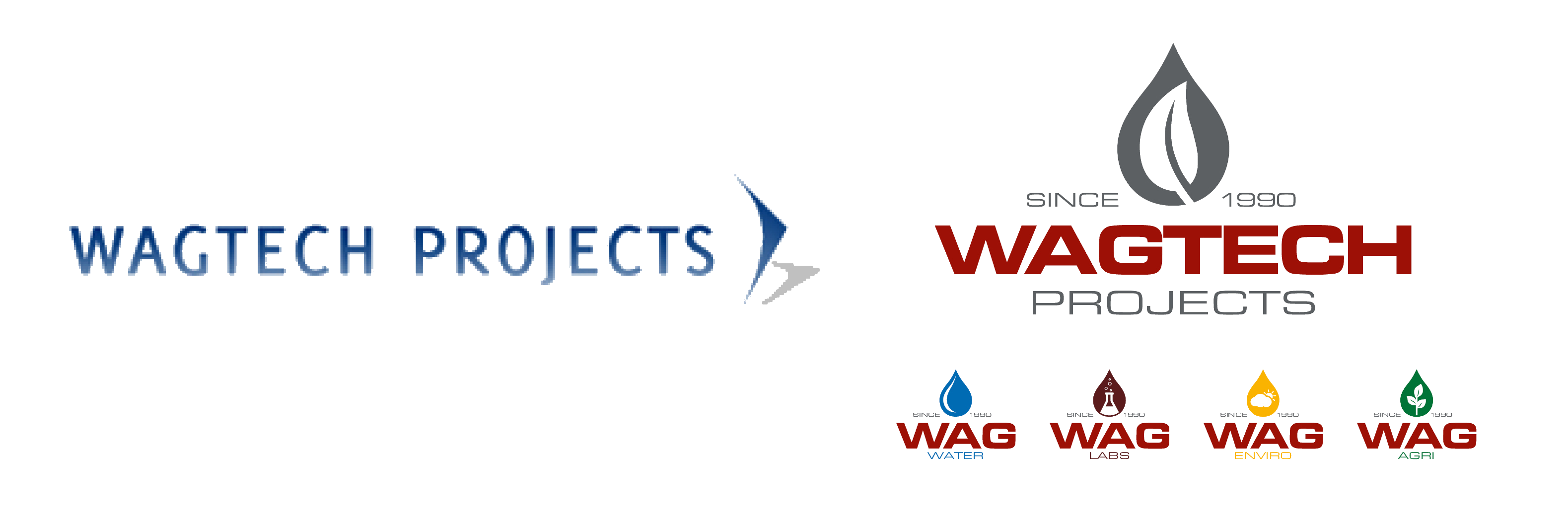
Here is an example we like for one of our clients Wagtech. Our aim was to create a more iconic, memorable brand logo which stand out versus competitors. We did this by improving the strength of typography and using their new company colour pallet. We introduced the water drop iconography to create a direct association between their logo and their business (water testing kits). We evolved this into the use of graphical items eg Leaf shape and other icons inside the droplet, making it very versatile for various product types.
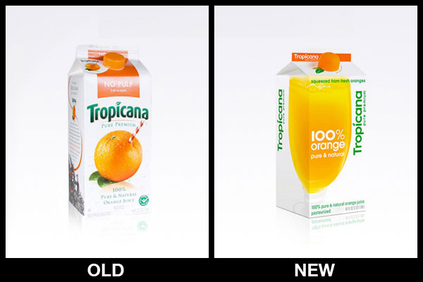
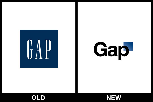
Back to the brand at hand, Morrisons, I believe this slower, more organic brand refresh is likely to be a wise approach, both short and long term. Many brands in the past have jumped into a substantial rebrand of their identity, logo, stores, behaviour too fast, leading to confusion and ultimately, disappointment. This is often caused by a lack of research and analysis (the scientific side of branding) and over emphasis on design and feel (the emotive side of branding). Good examples of failed re-brands include Gap and Tropicana as mentioned above. Interestingly you may not even be aware these big brands undertook a re-branding exercise at all. Customer response to the Gap rebrand resulted in the old logo being reinstated within days and Tropicana rebrand resulted in 20% decline in sales meaning the old packaging is what you see in store today.
This change along with refreshed in-store and company-wide approach will hopefully push Morrisons back in contention – or at least that’s what a guy from Yorkshire who has grown up with the supermarket chain thinks…
Don’t hesitate to get in contact if you would like to discuss any aspect on branding, including: Corporate identity, Brand Strategy & Positioning, Research & Testing, Message & Channel and Brand Guidelines.